Sabah Siddiqui's Photography
Thursday, June 4, 2015
Thursday, May 7, 2015
Tuesday, April 21, 2015
Tuesday, March 31, 2015
Writing with Light Group Experiment
 |
| ISO: 400 Aperture: f/ 4.5 Shutter Speed: 1.3 |
 |
| ISO: 400 Aperture: f/ 13.0 Shutter Speed: 10.0 |
 |
| ISO: 400 Aperture: f/ 13.0 Shutter Speed: 10.0 |
Monday, March 23, 2015
Friday, December 5, 2014
Elements and Principles of Design
Leading Lines: Technique of photography that leads the viewers eye straight to the main.
Vertical Lines: Communicate a sense of strength, power, rigidity, and solidarity to the viewer.
Diagonal Lines: unbalanced and appear to be unstable but what they communicate is very dynamic yet precarious.
Curved Lines: have a unique ability to add beauty and grace to a photo.
Symmetrical Balance: perfectly centered compositions or those with mirror images.
Asymmetrical Balance: one or more dissimilar objects on either side of the photo and these objects are not uniform in their appearance.
Unity: all elements of the piece combine to make a balanced, harmonious, complete whole.
Variety: obtained through the use of diversity and change by artists who wish to increase the visual interest in their work.
Movement: the path the viewer's eye takes through the artwork, often to a focal area.
Rhythm: a movement in which some elements recur regularly.
Emphasis: an area or object within the artwork that draws attention and becomes a focal point.
Proportion/ Scale: -the size of an object in relationship to another object.
Simplicity: looks for ways to give the center of interest in your pictures the most visual attention.
Texture: helps to emphasize the features and details in a photograph.
 |
| The lines of flowers lead to the windmill creating a leading line image. |
Vertical Lines: Communicate a sense of strength, power, rigidity, and solidarity to the viewer.
 |
| The trees are straight up making them vertical and they are just trees but it is very different. |
Horizontal Lines: Represent peace, tranquility, and quietness.
 |
| Complex line elements, such as curves, shape, tones, and color. |
Diagonal Lines: unbalanced and appear to be unstable but what they communicate is very dynamic yet precarious.
 |
| The bridge looks like it could fall any second even though it is stable. |
Curved Lines: have a unique ability to add beauty and grace to a photo.
 |
| This picture is simple but when you see it with the curved lines it adds a depth |
Symmetrical Balance: perfectly centered compositions or those with mirror images.
 |
| You can see a mirroring image of the Taj Mahal in the water. |
Asymmetrical Balance: one or more dissimilar objects on either side of the photo and these objects are not uniform in their appearance.
 |
| The rocks are not in any way symmetrical and they are not uniform. |
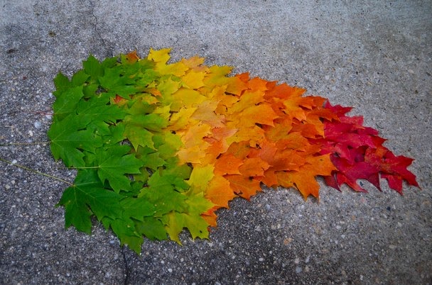
Unity: all elements of the piece combine to make a balanced, harmonious, complete whole.
 |
| There are four different colored leafs to make one big leaf. |
Variety: obtained through the use of diversity and change by artists who wish to increase the visual interest in their work.
 |
| There are different types of donuts in the picture. |
Movement: the path the viewer's eye takes through the artwork, often to a focal area.
Rhythm: a movement in which some elements recur regularly.
 |
| The cheetah is moving and it catches the viewer's eye. |
 |
| The flowers are blurred so the rings are the main focus of the picture. |
- the relative size of parts of a whole.
 |
| The hand is made to look like it is holding the hot air balloon but really it is just the way it is angled. |
Repetition/ pattern: repeating visual elements such as lines, color, shape, texture, value or image tends to unify the total effect of a work of art as well as create rhythm.
Horizon Line: where Earth meets the sky.
Rule of Thirds: aligning a subject with the guidelines and their intersection points.
 |
| The bird feathers have a repeated pattern o black, white, black white, etc. |
Bird's Eye View: an elevated view of an object from above with a perspective, as though the observer were a bird.
Worm's Eye View: a view as seen from below or from a humble positions.
 |
| In this image you can see the whole view of the river and city area. |
 |
| This picture is taken at angle to make it look like there is a worm or something looking at it. |
 |
| The horizon is drawn between the lake and the mountain. |
Rule of Thirds: aligning a subject with the guidelines and their intersection points.
 |
| The picture is divided by 3x3 and the different things are intersected. |
Framing: using other objects in your photograph to frame the main object.
 |
| The little ring is used to frame the building. |
Simplicity: looks for ways to give the center of interest in your pictures the most visual attention.
 |
| Everything behind the dog is blurred to make the dog the main focus. |
Texture: helps to emphasize the features and details in a photograph.
 |
| This photo was taken to show the details of the scales of the snake. |
Subscribe to:
Comments (Atom)


